The need for displaying data in a way that’s clear and easily actionable is a growing need as more people rely on software to help run their business. Yet, many marketing platforms don’t even get the basics correct.
They provide you with a list of charts and reports that look good on the surface. But once you start operating your business and truly relying on their native charts, graphs, and reporting, you start to realize the uselessness of it all.
No marketing platform does this great. It’s just some do better than others.
That’s why you have to be willing to take data into your own hands. Though it may be cumbersome for most, having the ability to extract your data from multiple sources and create a visual display of relationships between various metrics and measures is what I find most commonly missing today.
This is why you need a means of easily visualizing your data. Not just for charts, but to see how things are related and organized across your business. Good data visualization allows you to take quick action and make important decisions faster. In this month’s report, I’m going to discuss a few ways you can visualize your data to easily remain more actionable.
Listen to podcast episode #38 to learn the two-fold approach to making data driven decisions…
Remember, what you cannot easily take action on what you cannot easily see.
Performance Metrics
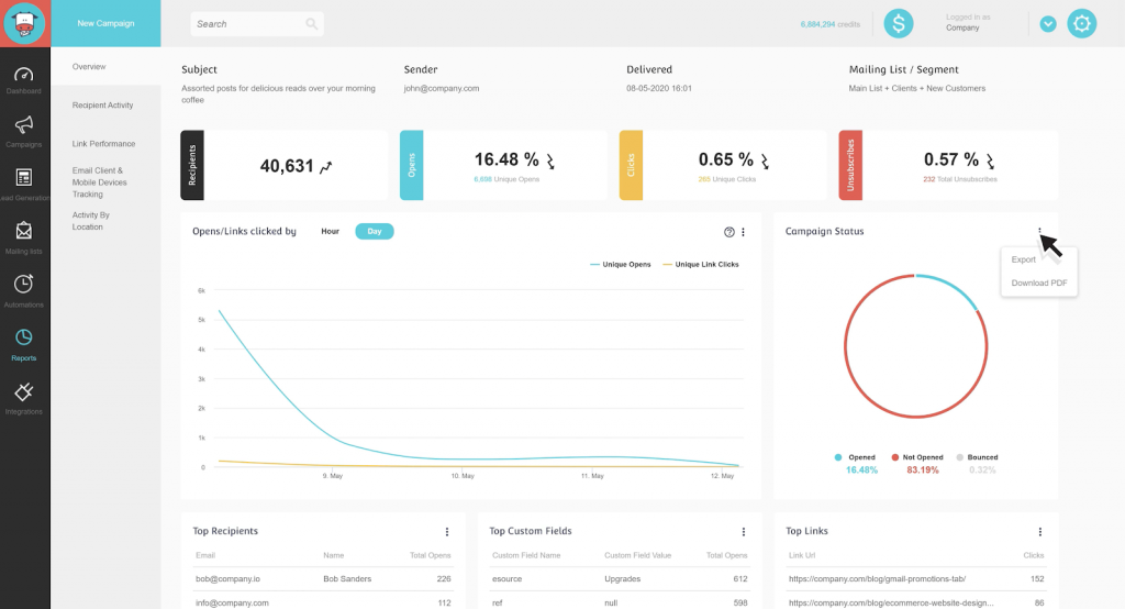
The most basic and fundamental need of all businesses is the ability to produce accurate charts and graphs around the performance of marketing activities. The challenge is that these graphs are often limited in displaying relational data.
For instance, many email marketing platforms will generate charts on the performance of emails you’ve sent. But most of them are limited in showing the relationship between email and revenue (they will instruct you to rely on Google Analytics for that).
[Screenshot of MooSend nice metrics for email, missing revenue reporting]
Pretty much all marketing automation platforms struggle with showing relationships between revenue and all other data they allow you to collect. Ontraport is the closest with allowing you to create custom reports relative to time.

But still leaves a bit to be desired when it comes to measuring data to revenue like: profitability of a segment, lifetime customer value, revenue per source, etc. Some of those metrics mentioned they do produce but are at the campaign level and not actionable or easily viewed globally.

[Ontraport’s Campaign Builder will show LTV and other metrics]
However, you have to give them credit because they offer much more than Infusionsoft or ActiveCampaign at this time.
Oh, and one more thing, this only works if you use their built-in payment processing. Taking payments outside of their ecosystem will make these numbers faulty.
Data Organization
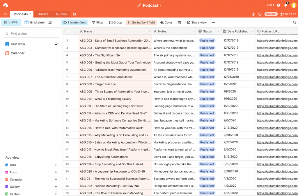
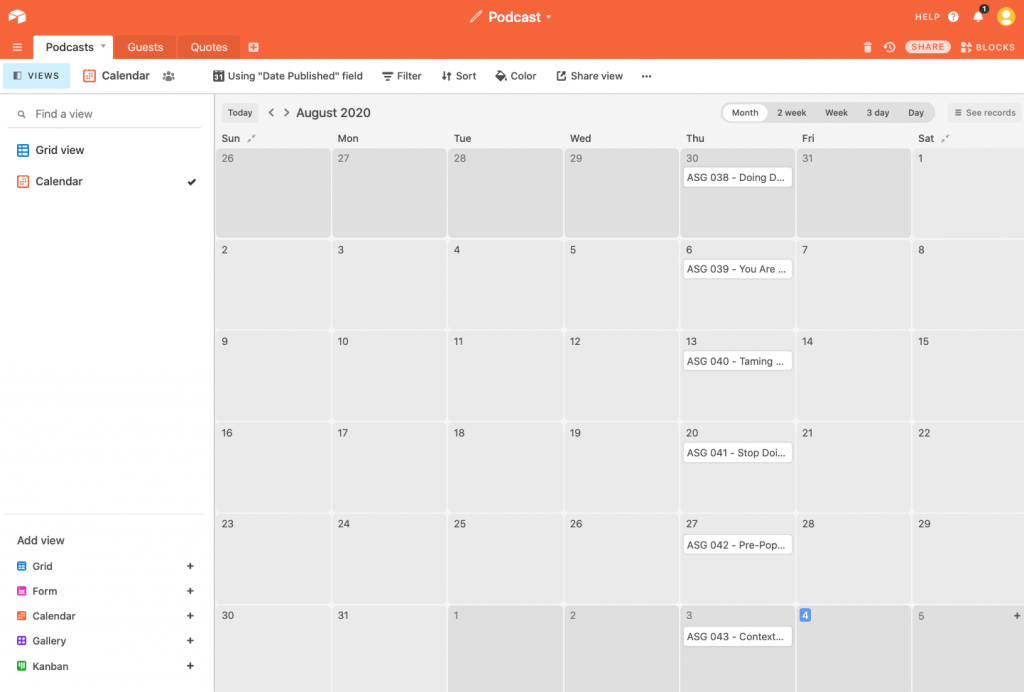
How you organize your data has an immediate impact on the efficiency of your business. I’m talking beyond having folders in Google Drive to keep things organized. You need a way to see the data you’ve organized in multiple ways. For instance, AirTable does a great job of this with their “Views” feature.
For my podcast database, I have one view of all the episodes produced, within a click of a button I can change to calendar view and see when each of those podcast episodes has been, or will be, published. This allows me to easily get up to speed with what went out, what’s going out and what's planned to go out to help identify any holes or gaps in content being produced.
Why AirTable when Asana and other PM tools can do the same type of viewing?
Easy answer…relationships.
You’ll see the other tabs in the images above named “Quotes” and “Guests” which allows me to easily link both databases to the podcast episode in which they exist. And I can create more tabs and relationships to easily connect to the episodes. Very helpful.
Notion is another good one. I like to use it to organize and display data in my CRM better than my CRM allows me to. I don’t believe in surrendering visualization how I need it to the hands of any platform. Instead, I will create the visualization in a way that is most fruitful for myself and my team in the tool of choice.
Below you will see a Notion page for Segmentation I created to see the relationship between messages sent, lifecycle stages, segments, and more.
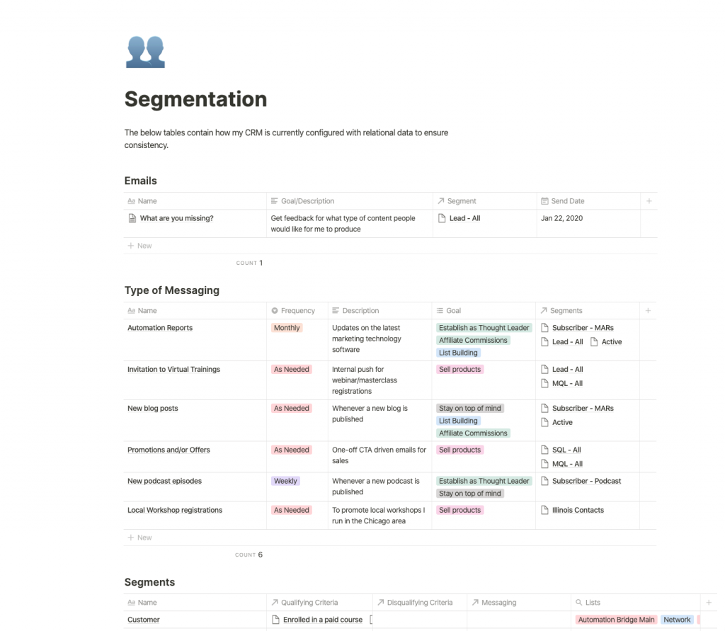
While all this is nice, and I recommend setting it up, it still lacks the relationship between contact performance within your CRM. I would love to be able to see historical data of the amount of people within a given segment at any given time.
Project Management
Lastly, project management software. I rely on this software in my business beyond collaboration and tracking status of projects, but to also display it in a way that’s easy to follow. Which is why I’ve always struggled with platforms like TeamWork and Basecamp and have gravitated more towards the Trellos, Asanas, and ClickUps (who just raised $35 million in funding by the way).
One of the features that stands out in a major way to aid me in this approach is ClickUp’s “Everything View”. Since you can have multiple spaces tied to one account (think of spaces as different clients or businesses) it is important to be able to see all of your tasks across all companies and/or clients. That’s what ClickUp’s Everything view does.
One click of a button and I can see everything that’s overdue, due today, and coming up across ALL the businesses I’m working with.
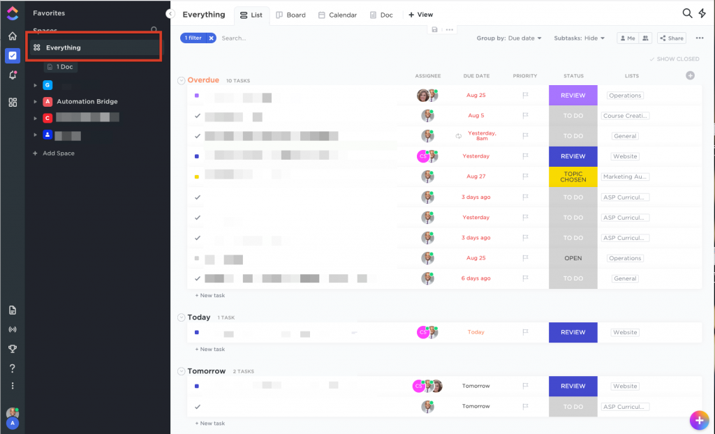
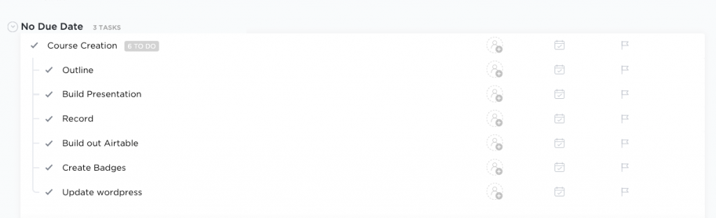
Another benefit around visualization with ClickUp is displaying subtasks. This may seem small but when you’ve used tools like Asana that force you to click on a task to see the subtasks you really appreciate such attention to visualization detail.
Closing Remarks
There are many ways to visualize your data depending on your needs and how efficiently you desire to operate. The key is you being aware that capturing and organizing the data isn’t enough. If you want to take strong, immediate action you will need it displayed in a way that is conducive to that.
Specific to marketing and sales metrics I can’t stress enough the importance of keeping things simple. You’d be surprised how far a spreadsheet can take you in terms of creating charts and graphs that show relationship between various data sets.
It may require a bit of manual labor to export the data from various sources, but it’s an effort and practice that will pay off greatly.
If you have any strategies or tools you’re using with success to display your data in a way that makes taking action easy, share in the comments below.